

The Science of Menu Design
These research-backed methods lead to better sales
The first time Kevin Jennings dined at a James Beard-nominated restaurant in Raleigh, North Carolina, he was confused about how to order. He blamed the menu. “The entree- and appetizer-sized items were mixed together on the menu and we had no idea of portion size,” says Jennings, co-owner of Urban Food Group, which operates six restaurants in North Carolina and Colorado. “We tried to decipher how much to order based on the prices and advice from our server, but it was confusing.”
A menu does more than describe dishes and list prices. A well-designed menu reinforces a restaurant’s identity, improves service times and entices diners to order certain dishes, boosting revenue. The menu is so mighty that global restaurant consultant Aaron Allen calls it “the most important piece of information a restaurant produces.” “It is a product list, price list, guest communicator and brand differentiator rolled into a single document,” he says. “It should be the best server you have on the floor.”
Sounds daunting? Maybe not so much if you consider these science-backed tips for getting it just right.
Looks Are (Almost) Everything
Paper, plastic, cardboard are all materials that communicate brand image, Allen says. For example, thick paper or menus tucked into leather sleeves send the message that the restaurant and the food are high-end. “Our menu feels good to hold,” says Ben Lubin, chef-owner of the Blind Monk in West Palm Beach, Florida. The aged brown leather sleeves that cradle the restaurant’s menus makes diners feel like the Blind Monk has withstood the test of time, he says. For Avelina in Denver, Jennings prints menus on thick paper with date stamps. “It helps diners see that the menu changes, that the food is fresh; a date stamp makes those inferences,” he says.
Capitalize on Color
It’s important to use colors that reinforce logos and brand imagery, but some tones may do more harm than good. Print a menu with blue ink on blue paper and diners may not order dessert. That’s because research suggests blue is an appetite suppressant. Red, on the other hand, can stimulate appetite; some restaurants use the hot hue for meals with the highest profit margins to encourage sales. Urban Food Group uses bright colors on several of its Raleigh restaurant menus. Red ink highlights each section heading at Coquette Brasserie; on the Chow menu, orange provides a pop of color that makes the menu headings stand out; and to direct diners to specific dishes at Vivace, the primi section of the menu is highlighted with an orange border.
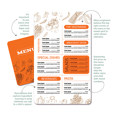 Using photos is another way to introduce color on a menu. If a concept permits it, rather than staged stock photos, Allen suggests a style similar to the amateur photography diners post on Instagram. “These authentic food photos are more effective than stock photos that are used on hundreds of restaurant menus,” he says.
Prioritize Placement
Most diners don’t read menus from top to bottom, left to right. Menu engineers believe the top right corner of the menu is the sweet spot to catch diners’ attention—and Jennings agrees. “A lot of repetitive sales come from that corner of the menu,” he says.
To capitalize on placement, he switches up the locations of dishes on all of his restaurants’ menus. Seasonal, cost-effective items get the coveted top right corner; dishes prepared with pricier ingredients are placed in less visually commanding areas of the menu. Lubin takes a different strategy: He knows the Blind Monk’s bacon and egg biscuit is one of the most popular items on the breakfast menu, so he lists it last. His rationale? “I want people to read all the way through the menu to find it,” he says. “I want to tempt them with some lighter bites to go along with their main item.” His approach is backed by science: The serial position effect leads people to remember the first and last items in a list best.
Use Your Words
Descriptive titles, like “Nana’s Favorite Chicken Soup and Country Peach Tart,” can help boost sales up to 27 percent compared to simpler ones, like “Chicken Soup and Peach Tart,” according to researchers at the Food and Brand Lab at the University of Illinois (now located at Cornell University). Specifically, descriptions that capture ingredient sourcing or prep methods can add to a dish’s appeal. At the Blind Monk, bacon kettle corn is described as, “Appalachian heirloom sweet flint popping corn with sea salt,” and the description for warm biscuits highlights the creamed honey and softened farmstead butter served with the dish. In addition, menu descriptions include the names of standout farmers and producers.
“We want the menu to do as much of the work as possible of describing a dish to our guests,” Lubin explains. “The more description we can provide, the fewer questions guests will have for our very busy servers who are trying to balance providing warm, attentive service to all guests even when we are really crowded.”
But Don’t Spew Word Vomit
Hit those moneymaking descriptors, but don’t get wordy. “Too much description can be overwhelming,” adds Jennings, who says his group’s approach to menu descriptions is “minimalist.” “It should be long enough to describe the food, ingredients and how it’s prepared,” Allen says. “When the descriptions are too long or there are too many items on the menu, diners need extra time to read through the menu, and it slows down the speed of service.” Varying the length of descriptions can help highlight more profitable items. On a menu with mostly shorter listings, giving items with lower food costs a longer description will draw the attention to that item, Allen says.
Pick the Right Price
While pricing items requires researching food costs and performing complex calculations, expressing the price on the menu should be much simpler. Allen recommends skipping the dollar signs and sticking with round numbers. For example, an item priced at $10.95 is better expressed as 11. At Avelina, to make the prices less conspicuous, Jennings places them at the end of each item description instead of lining them up with the header. “These are the kinds of small placement decisions that make a difference,” he says.
The Net Net
Too tired to read? We pulled out the most relevant points on menu placement to encourage better sales.
- Hot hues like red and orange stimulate appetite.
- Cool colors like blues suppress.
- Amateur photography (like Instagram) adds color and authenticity.
- The sweet spot is the upper right corner of the menu.
- People remember the first and last items of a list best, so put slow movers there.
- Omitting the dollar sign or spelling out a price—eleven versus 11—works better for pricier items.
Infographic
Trend Tracker: Winter 2021
The heat index on the latest trends in the food service industry.
By the Numbers: Winter 2021
Play these numbers for a bigger payout.